
Times Supermarkets - Corporate Logo Design
Times Supermarkets is a supermarket chain based in Hawai’i. They first opened in 1949 being the 2nd supermarket in Hawai’i. Their current logo is charming and nostalgic, but is not timeless and is only iconic to a particular demographic that is getting older and passing by. With this logo redesign, I wanted to challenge myself by choosing a company that I’ve grown up with, and to appreciate its history but also not be blinded by the memories I have there.
Skills
Identity, Vector Illustration, Sketching, Typography
Challenge
To be recognizable to its current demographic, but appealing to a younger audience that may not have considered Times other than with their parents/grandparents. A way to get people engaged and interested.
Solution
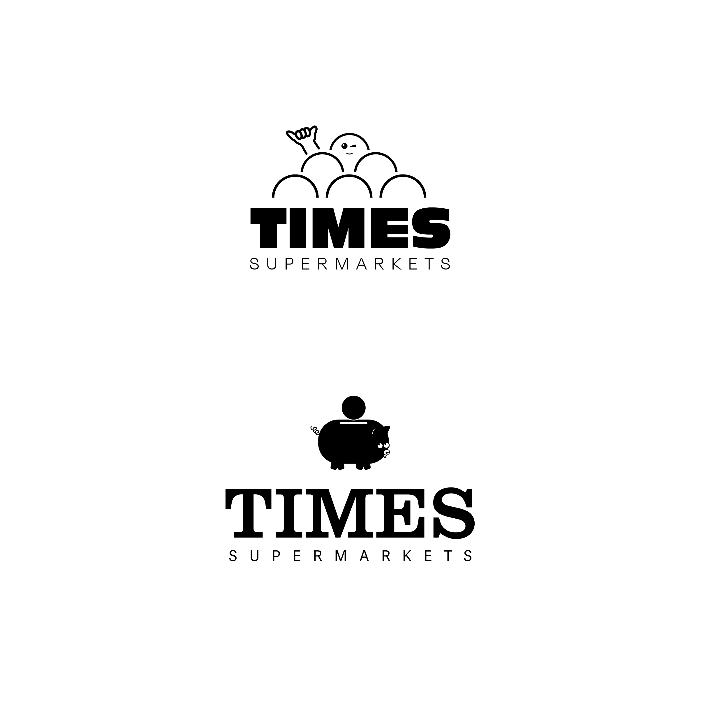
A new identity that is still charming and has a touch of that nostalgia. The charm is seen in the piggy/piggy bank's expression. That similar expression is a nod to the previous logo’s “wink and smile”. The logo gives room for potential ad campaigns (animations, commercials, etc.) and branded bags/merchandise that can be used on their next visit.


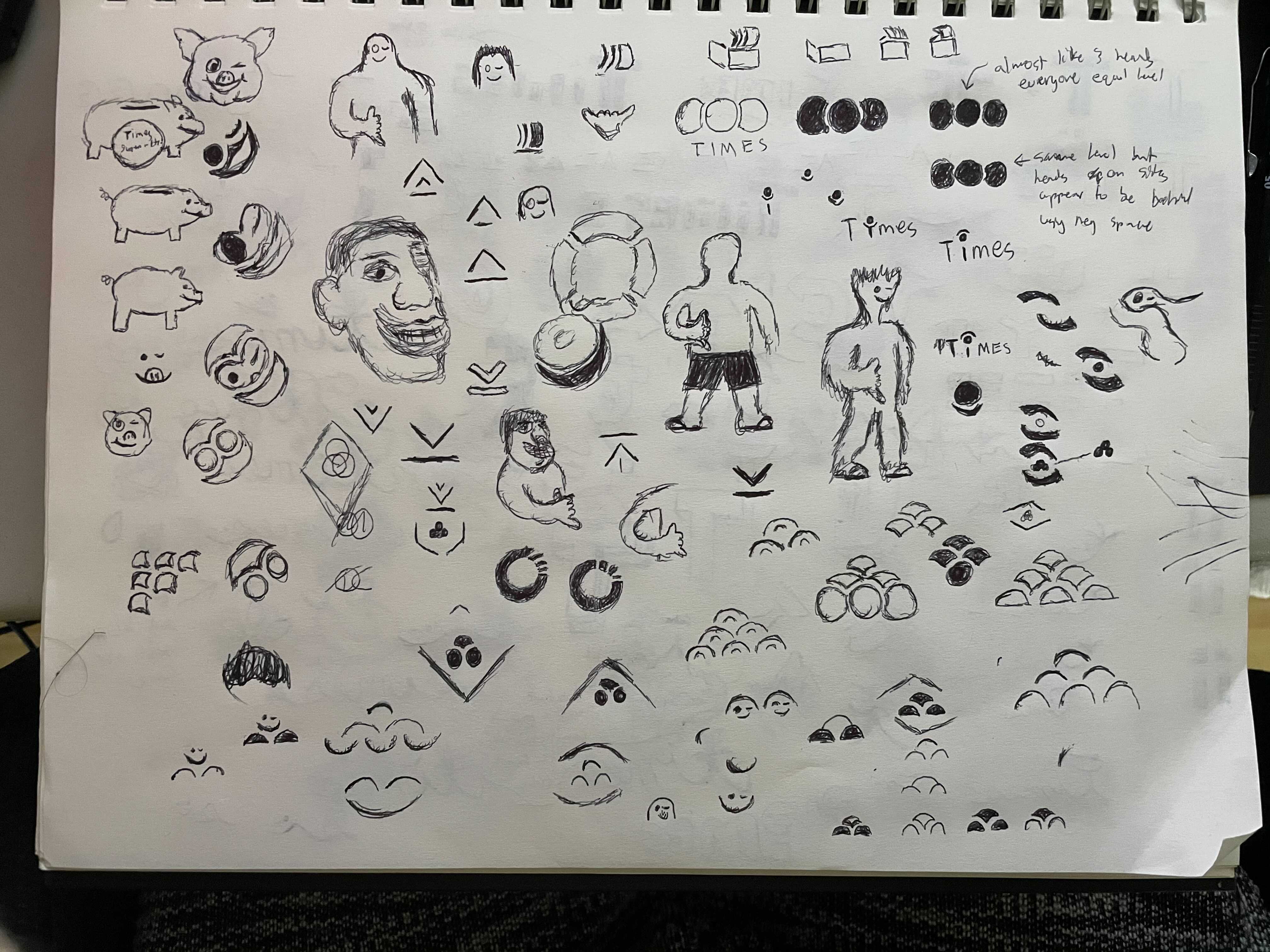
Sketches
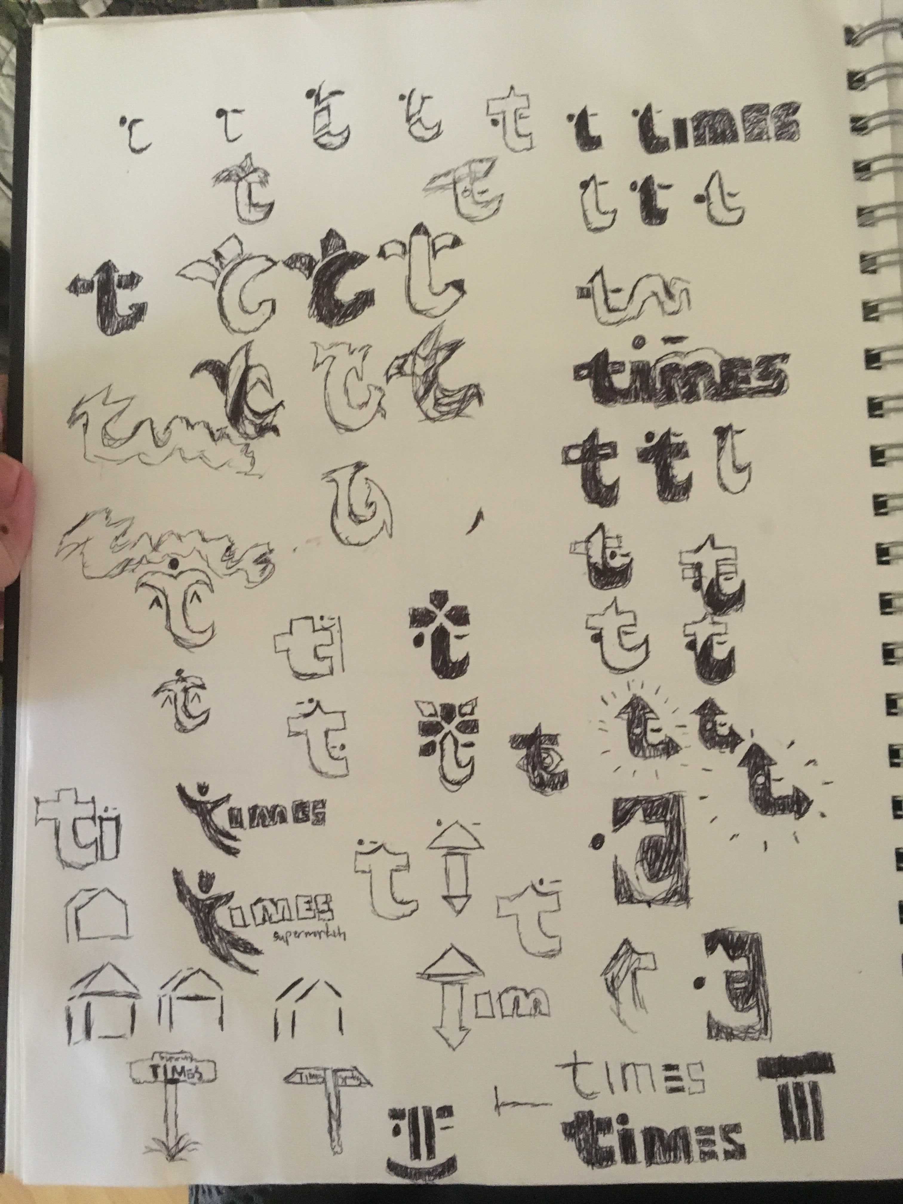
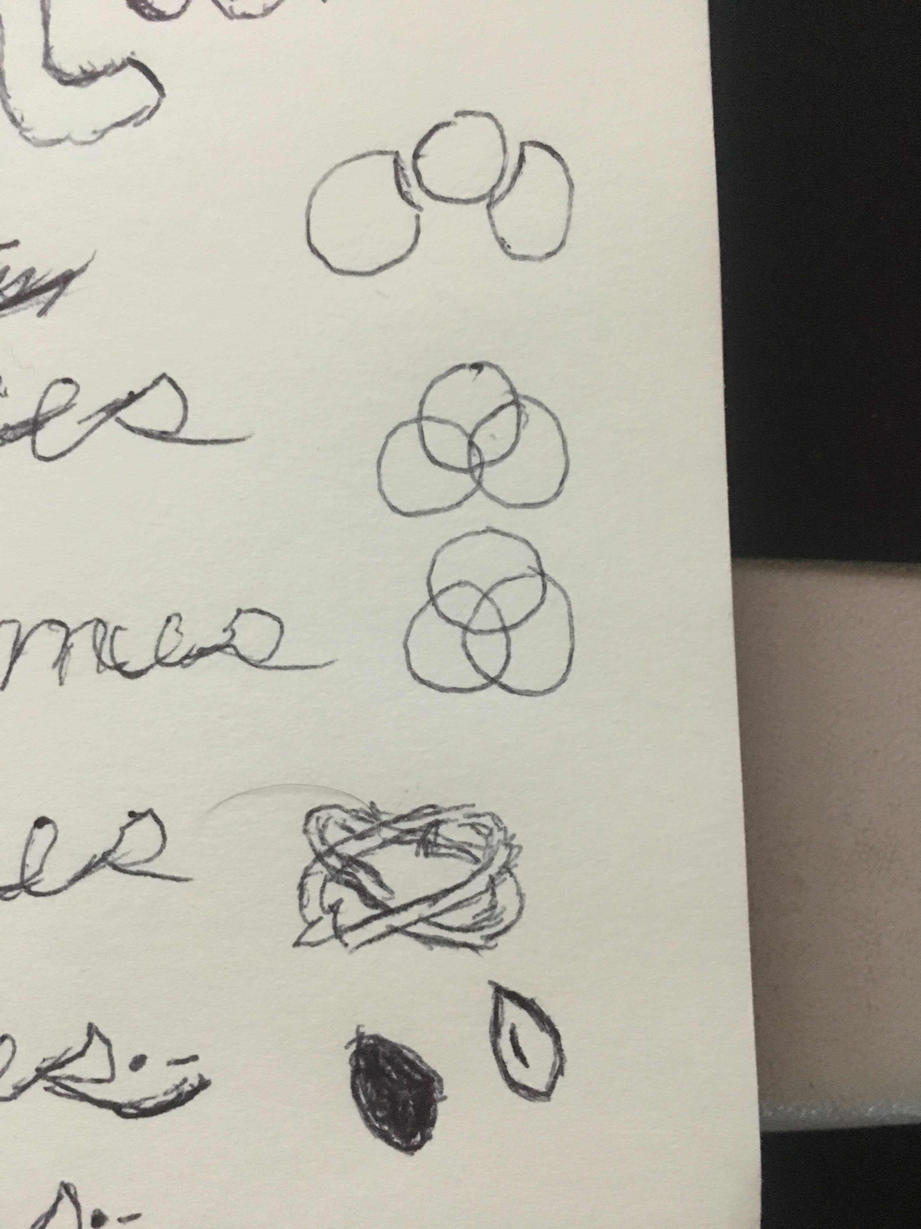
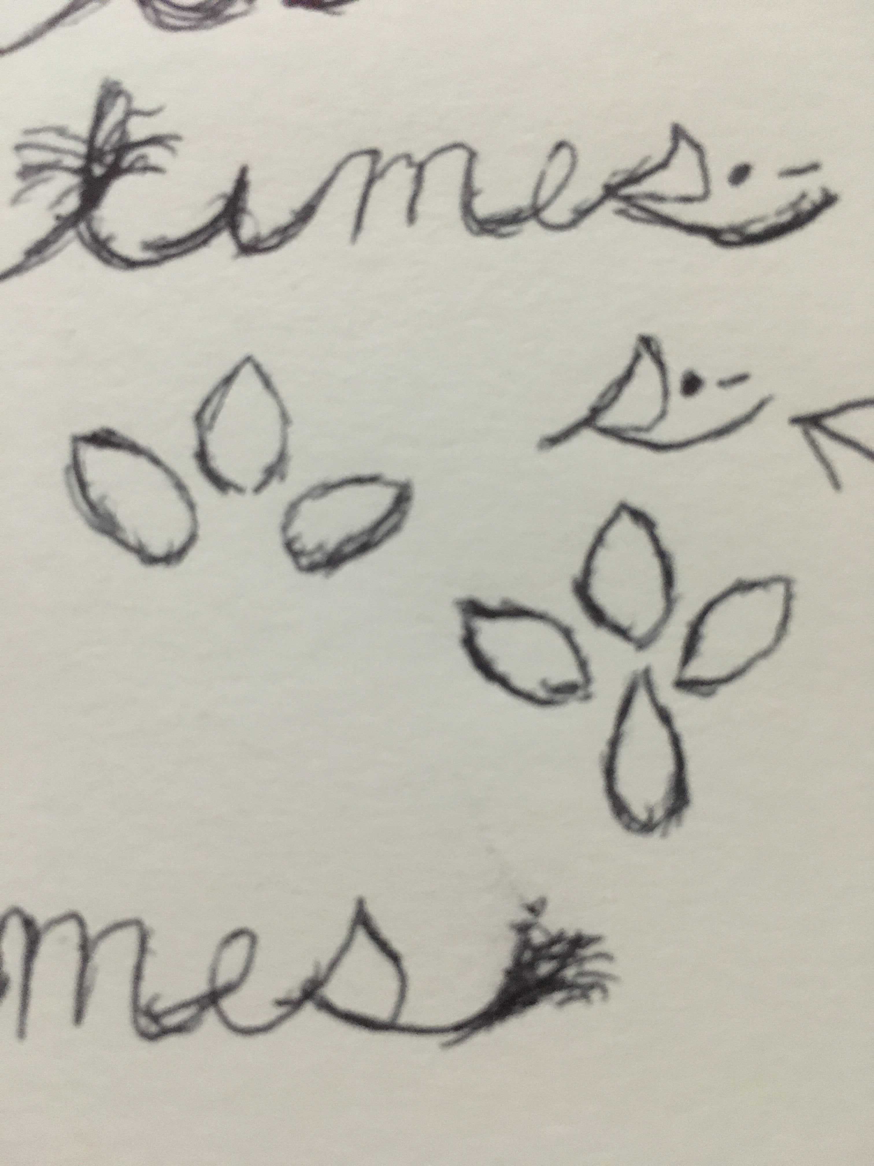
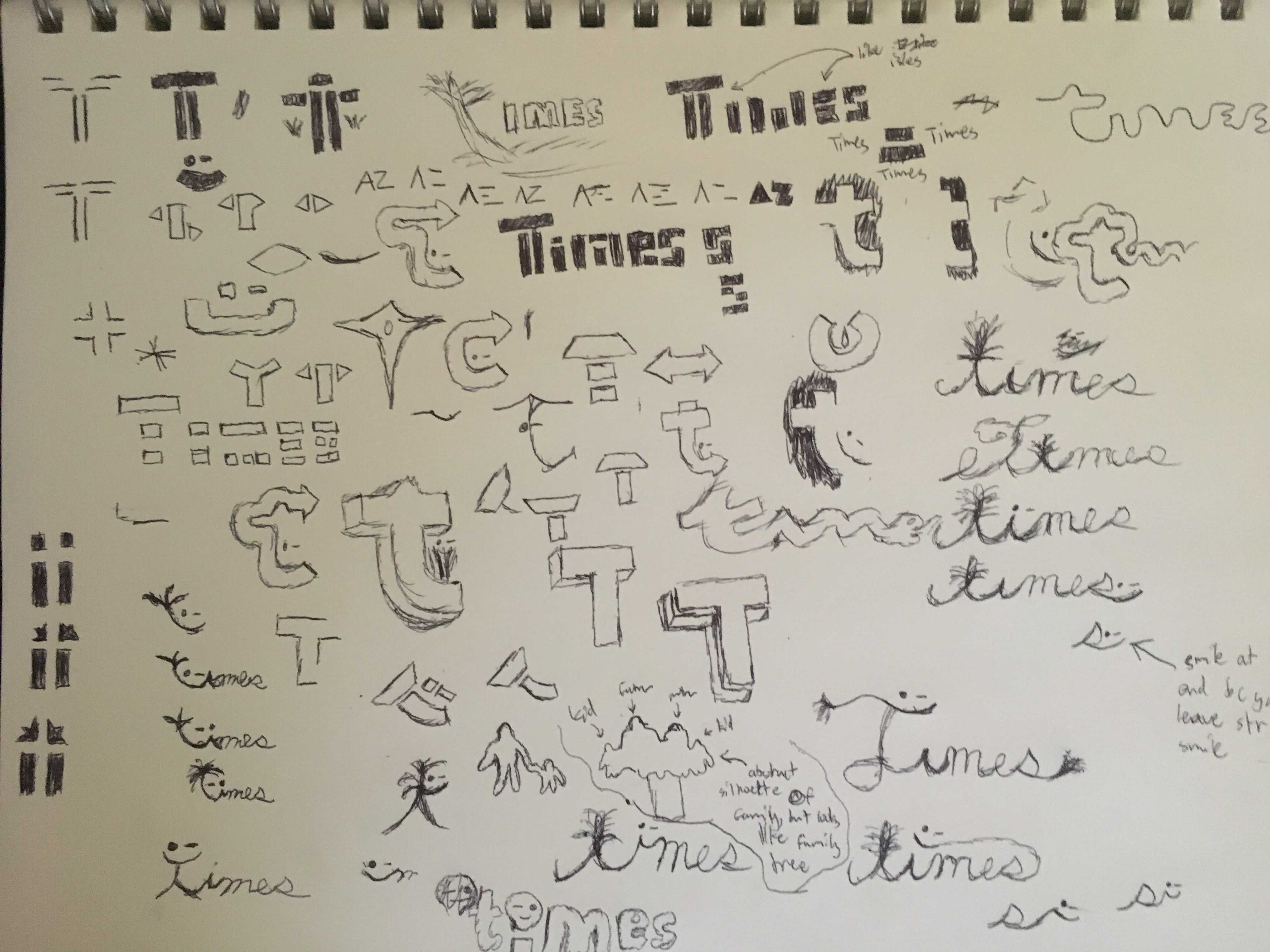
While sketching my goal was to find a solution that either caters to the supermarket’s local history or an element of the previous logo that can be found in the new one. The new one being iconic, timeless, and versatile.



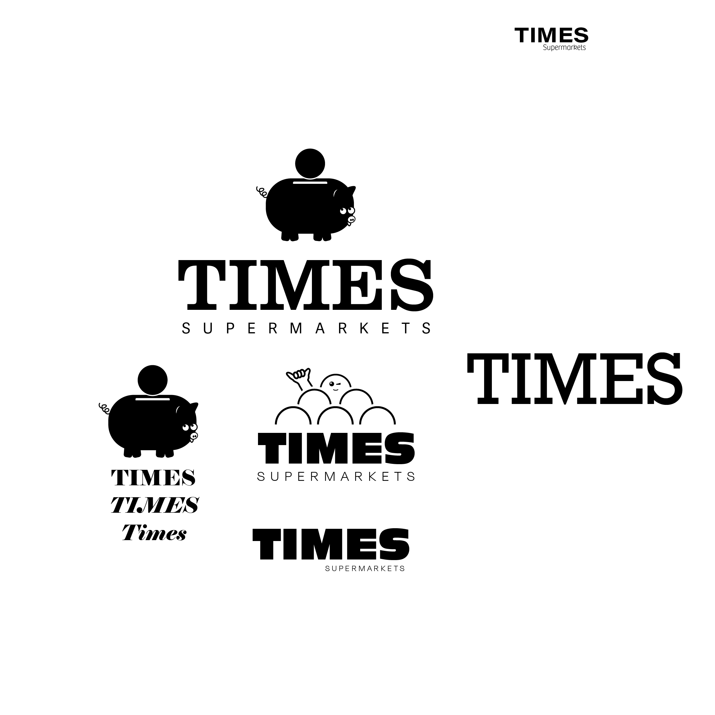
Typography
Clarendon URW gives Times a feeling of modern but old. It is a serif type that still resembles a sans serif type because of its shape. Adelle Sans is a nice supporting type that contrasts from the big “Times”, to make things clear and readable. This gives the logo with type clear hierarchy and readability.


Color
The colors were chosen to bring an enthusiasm for shopping at Times and using the branded packaging/bags. The orange gives excitement and warmth, while the yellow is a sign of wealth and wisdom. Finally, the gray being the foundation for it all.
