“indgns” web design - UI/UX/Programming
“Indgns” started as “Indigenous”, a clothing brand trying to shed light on different cultures. The designs were more telling and loud, not leaving much for interpretation. Now, indgns is about portraying aspects of the human experience through our eyes and expressing it not only in the products, but in the visuals surrounding it. This would be done through some telling, but also leaving room for interpretation to encourage the viewer to think. The website should be an experience on its own. Encouraging visitors to engage, but not pressuring a sale.
Skills
Branding, Copywriting, Photography, UI/UX, Programming
Challenge
Capture the visitors attention, have them appreciate it as a standalone piece, and promote engagement (conversation and sales). Use my own original images and original content for the web page, while keeping a consistent look in the imagery. For the final version, I decided to make a series of staggered images that look out of place, but are actually within an organized grid system.
Solution
Create a visual experience that triggers an emotional response from the viewer. Capturing their attention with content and products presented in an artistic way, rather than product focused. Something that people would want to experience more than once, creating a strong bond between the visitor and the brand. Using space and a grid system to organize content to lead visitors through the page.
Click the image below to check out the coded site. For the best experience, view on desktop.
Process
Started with a design brief, then a site map and style guide. Created two different wireframes and then three drafts from those wireframes. The idea was to have unique options to explore different routes of getting the feeling of the brand to be expressed throughout the page. Using all original content for each draft and the final site.
Typography
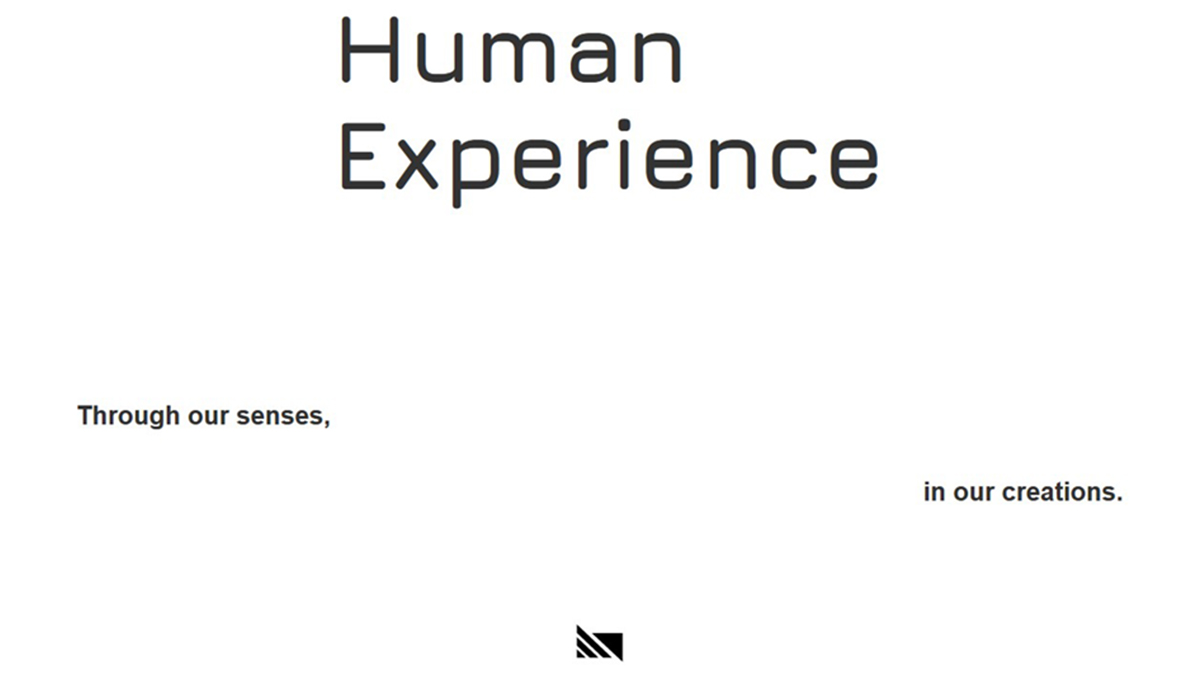
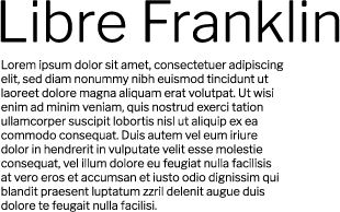
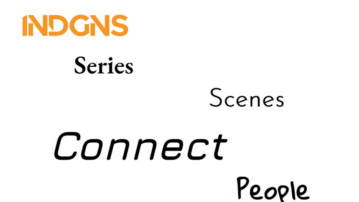
I decided to use Google Fonts for this project due to its ease of use and optimization. I went with Jura for the main header because it is of the Eurostile form, which has a sort of uniformity throughout the letterforms and is geometric. This is important because as humans we all have the same underlying structure, and are built this way from the collective experience of our ancestors. That is why I used it for “Connect” as well because through that same structure and human experiences, we can all connect initially. EB Garamond for “Series” was appropriate to portray a historical feeling, the series section is almost like a record/bible for the current release. The “Scenes” button needed a modern-vintage style with grace since this section will have a mix of present day and past scenes in its imagery. To accomplish this I went with Josefin Sans. People are so complex, and when in their comfort spaces, are organic and expressive. With that said, the “People” button needed to be a handwritten style typeface Gloria Hallelujah. Libre Franklin was used for the headers and captions as a supporting text to the imagery. It doesn’t demand a lot of attention on its own and is legible.


Color
The colors for the website were taken from the brands upcoming products, with a focus on keeping it simple; letting most of the color come from the original imagery. The orange used is an inviting and eye catching color and used subtly as an accent in certain areas to highlight text when hovering. All colors are available in the style guide.
